An in-depth look into user research done at Medallrugy, a user research agency.
Due to a nondisclosure agreement, identifying characteristics and some deliverables of the project have been left out.
Community forums are used to discover solutions and to allow open discussion of various topics with other users. In the tech community, these forums are very insightful for developers, designers, and IT professionals that are looking to solve technical issues.
Our client had done a massive overhaul on the desktop user interface and functionality of their forum. With a team of three other researchers, we were tasked with testing and validating their new designs. My role within the team involved coordinating respondents, creating research material, conducting usability test sessions, and analyzing the data into actionable insights.
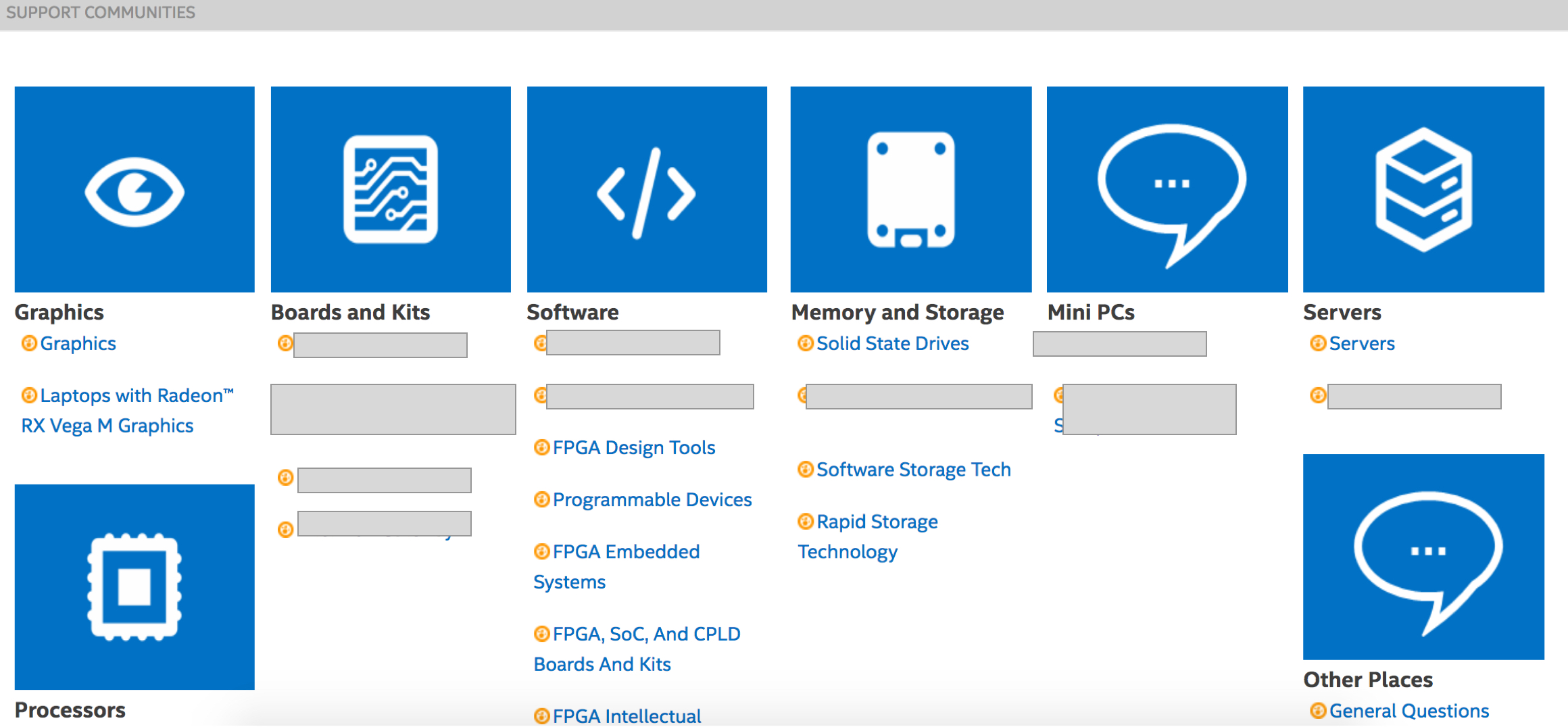
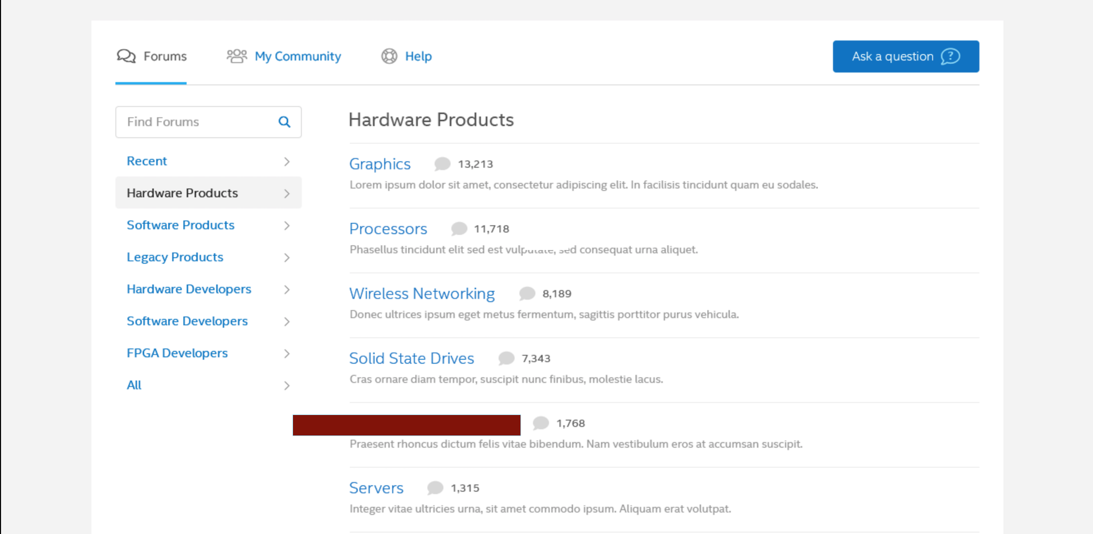
The original design vs. the new design of the forum.
I was given specific constraints to work with by senior researchers such as what forum features to test, what main insights stakeholders expected to attain, and the time frame of the project. As we waited for the prototype to be finalized by our client, we began by getting context into the the type of users that would use the community support forum.
We made profiles of the type of users that would visit the forum so we could accurately recruit relavent respondents. We based our profiles based off data from stakeholder interviews and an analysis of the different forum topics. I was not apart of the stakeholder interview process, but played a role in the coordination of confidential user information. We divided the types of users into three specific cohorts.
We recruited FPGA developers, software developers, and technical support seekers. We recruited five users for each cohort via UserInterviews. The users were screened to get a diverse sample of respondents with different ranges of professional experience and age.
As researchers, we had an open discussion regarding what everyone defined as “good UX” for a community support forum. I described how a well-designed community support forum had a clear ranking system to verify legit answers, chunked different information into relavent topics, and had a defined hierarchical visual design. We believed having an open discussion could fill in our gaps of knowledge while we were still waiting on the prototype to be finalized by our client.
We analyzed the design of popular community support forums (Reddit, Stack Overflow). The main purpose of the competitive analysis was to orient ourselves in the product we were going to test and help us give a more effective evaluation of the forum after we tested it on users.
Soon after, we recieved the prototype of the community support forum via InVision. We learned what features we had to test on the prototype and developed the user flow for these different features. Because we did not play a role in the design of the prototype, it was very significant for us to be familiarized with the user flow before we took any further steps. We used an Excel spreadsheet to list all of the various user flows for the different features the prototype allowed us to accomplish on InVision.
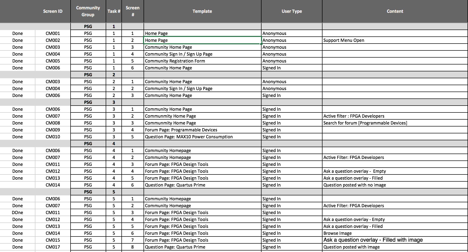
With the user flows completed and a greater understanding of the prototype, we developed scenario-based tasks for the different features we needed to evaluate. The scenario-based tasks had to allign with the goals of the task (e.g., registering for the forum) and follow a discussion guide we would use for usability testing.
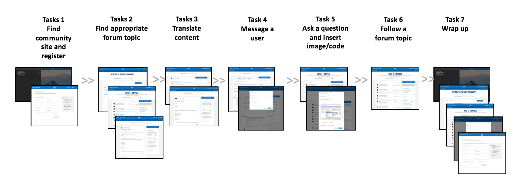
“You need information about __ power consumption. Using the prototype website, find the most appropriate forum for __ power consumption information.”
A disccusion guide was created after defining the tasks. This was the most important deliverable we had to develop because it would help us conduct the usability test more effectively, provide key insights for our stakeholders depending on the questions we asked, and give us variety in data (e.g., what users said versus what they actually did).
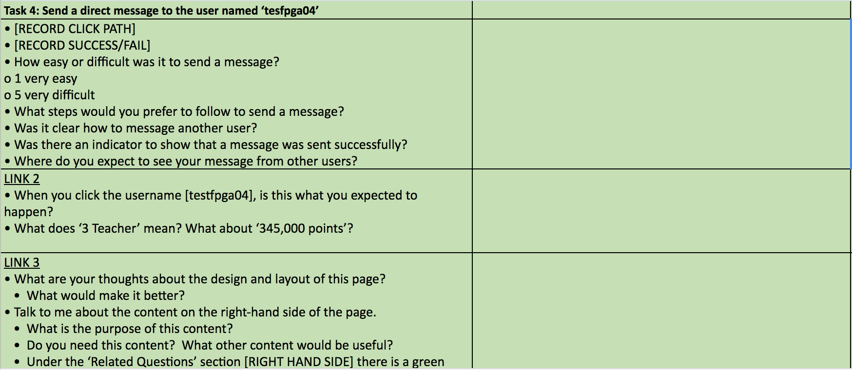
The discussion guide was essentially a list of behavioral questions that we could probe respondents with. The goal of the discussion guide was to help us facilitate non-rigid conversations with our respondents. We designed our discussion guide to have open-ended qualitative questions and likert-scale quanitative based questions after completing moderated tasks. The questions were strategically created to assess findability, template design, content relevancy, and any general UX improvements of the community support forum.
On testing day, I tested five respondents from the three different cohorts (FPGA, Software, Tech Support). Some sessions were moderated independently, while some sessions had a notetaker to assist. All sessions were recorded using a remote meeting software.
I worked as a notetaker and an independent moderator. I experienced minor hiccups such as audio issues, connection issues, and a difficult respondent. We discovered that most respondents were able to generally complete the tasks we designed with success using the prototype website. However, some respondents also struggled with tasks related to finding specific types of information. For example, some respondents struggled with finding the registration process and navigating the different search features.
A presentation was created with other researchers to highlight the background of the study, our methodology, and key takeaways. The presentation was chunked into the different tasks and featured a summary of our notes from the discussion guide, a relavent quote from a respondent, and an actionable reccomendation.